The fitness app retention problem is well documented. Most apps lose 70-80% of new users within the first 30 days. The drop-off peaks around day 10-14 - after the novelty has worn off and before any visible physical progress has occurred. The user joined with a goal in mind. They have been consistent for two weeks. They look exactly the same. They cancel.
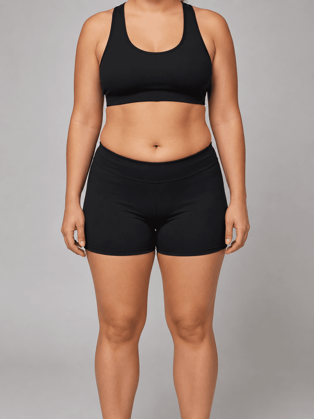
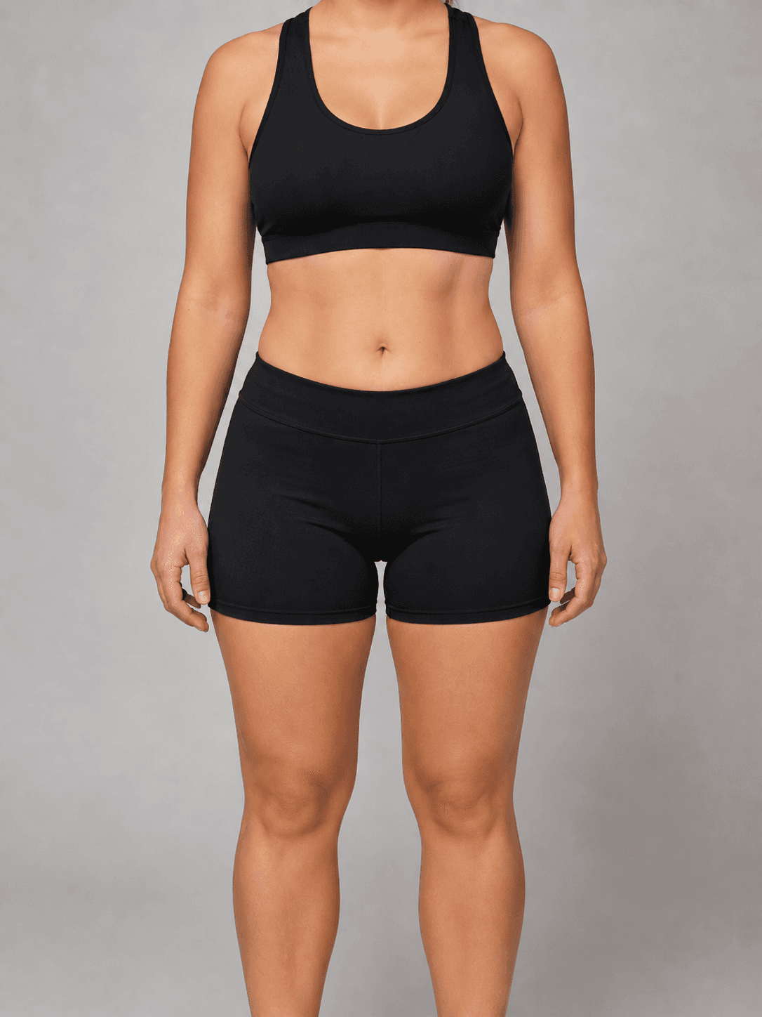
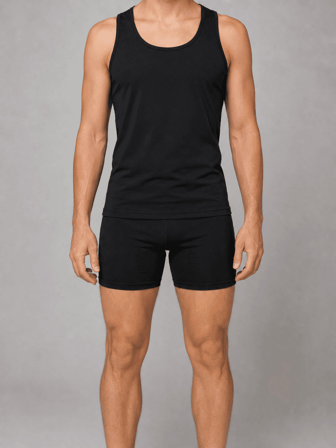
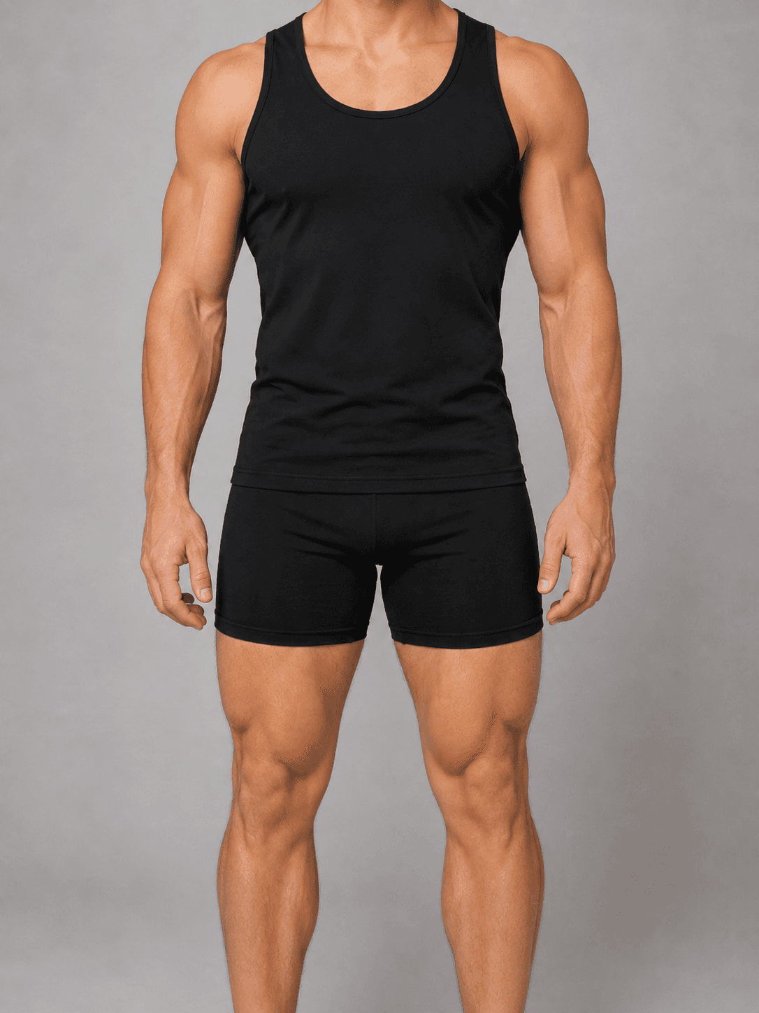
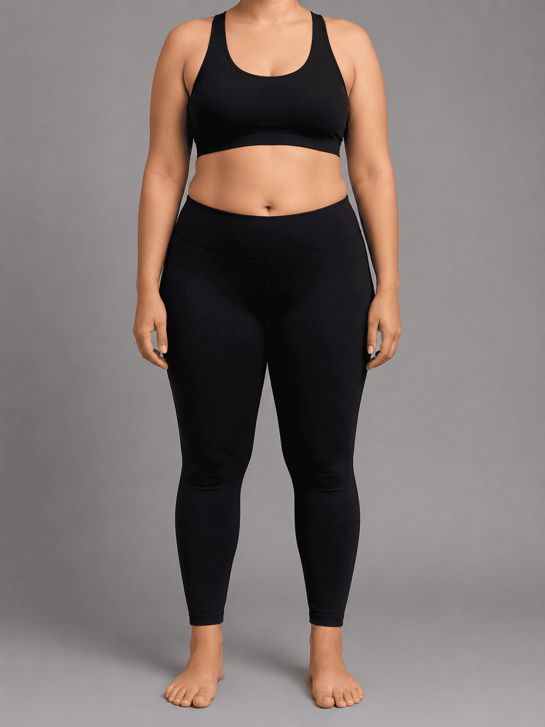
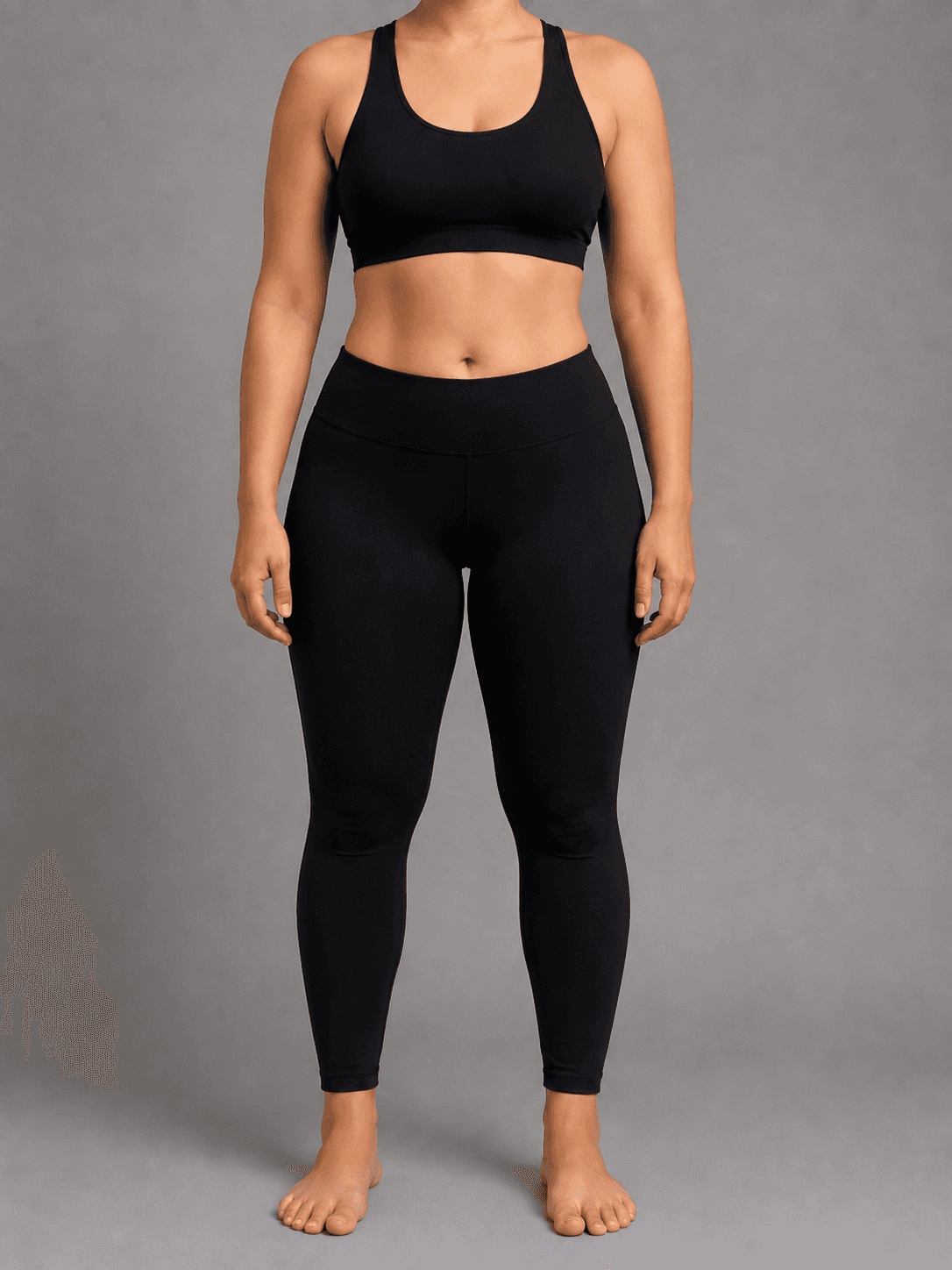
Body transformation visualization is a direct attack on this problem. Instead of asking users to imagine their goal, the app shows it to them. A photo taken at signup is processed through a pipeline that generates a realistic visualization of their target physique - the fat loss goal, the muscle gain goal, the athletic recomposition goal - rendered on their own body. The visualization becomes the anchor. Users train toward something they have already seen.

| Stack | Infra /mo | AI team | Total cost | Revenue | Margin |
|---|---|---|---|---|---|
Runflow 10% volume discount applied | $1.1K | $0 | $1.1K | $8.0K | 87% |
Cloud API + manual QA similar pricing · no auto-QA · part-time engineer needed | $1.2K | ~$5K | $6.2K | $8.0K | 23% |
Self-hosted GPU raw compute · full-time AI engineer required | $400 | $12K | $12K | $8.0K | loss |
Runflow Sentinel — built-in quality control layer that automatically detects and discards failed or low-quality outputs before delivery. You only pay for images that pass QA. No engineer needed to babysit the pipeline.
Pricing based on Runflow published rates (June 2026) with automatic volume discounts. Revenue column is illustrative — actual client pricing varies by vertical and contract size. GPU self-hosted estimate uses $0.04/img raw compute cost.
Why retention fails before progress is visible
Fitness progress follows a non-linear curve that is invisible to the user for the first 4-6 weeks. Strength increases, metabolic adaptations begin, body composition shifts - none of this is visible in the mirror. The scale moves slowly or not at all for the first two weeks as water retention offsets fat loss. The user is doing everything right and seeing nothing. This is the window where cancellation happens.
Traditional retention mechanics address this with streaks, badges, and milestone notifications. These work at the margin. They increase the cost of cancellation slightly but do not address the underlying problem: the user cannot see where they are going. A streak tells them they have been consistent. It does not show them what consistent effort produces.
Transformation visualization shifts the psychological frame at signup. The user is not starting a process whose outcome they have to imagine - they are working toward a goal they have already seen rendered on their own body. The visualization becomes a reference point they return to. Check-in photos are compared against the visualization target rather than against a generic before-after testimonial that does not look like them. The goal is personalized in a way that stock photography cannot replicate.
The technical pipeline
The transformation visualization pipeline runs four stages. All four must execute correctly for the output to be commercially usable - a failed segmentation or an anatomically inconsistent generation produces an output that makes the problem worse, not better.
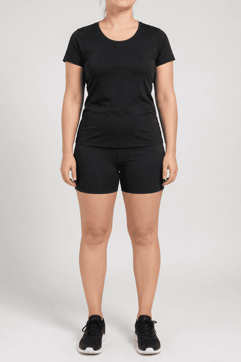
Stage 1 - Pose detection and normalization: the intake photo is analyzed to detect body pose keypoints. The pipeline extracts the skeleton structure (shoulder width, hip width, limb proportions, stance) and normalizes it for the generation stage. This step determines what the current body geometry is and maps it to a coordinate system the generation model can work with. If the user's intake photo is taken from an angle or with an unusual pose, normalization corrects for this so the output is anatomically consistent with the input.
Stage 2 - Body segmentation: the body is masked from the background and clothing. Segmentation produces a clean outline of the body geometry that the generation model uses as a spatial constraint. The quality of the segmentation mask determines the sharpness of the body outline in the output - a sloppy mask produces an output with blurred or inconsistent edges where body meets background. This step uses a fine-tuned segmentation model trained specifically on full-body fitness photography.
Stage 3 - Goal-state generation: a diffusion model generates the target physique constrained by the pose skeleton and segmentation mask from stages 1 and 2. The generation takes three inputs: the normalized pose skeleton, the body segmentation mask, and a goal configuration (fat loss percentage, muscle gain target, or athletic recomposition profile). The output is a photorealistic rendering of the user's body at the target state - same pose, same framing, different physique.
Stage 4 - Compositing and output: the generated body is composited with the original background and clothing where appropriate. Lighting correction ensures the generated physique is consistent with the ambient lighting of the intake photo. Color grading matches the skin tone and overall image aesthetic. The output is a side-by-side or overlay visualization - current state left, goal state right - formatted for in-app display.
Goal configuration: what the app controls
The generation model produces different outputs based on goal configuration. The fitness app defines what goal states are available and how they map to the app's program structure. Three goal types cover the majority of fitness app use cases.
Fat loss: the pipeline reduces body fat percentage on the segmented body geometry by a specified amount. The app configures this as a program length target - a 12-week program targets a realistic 8-12% body fat reduction. The output shows the user's current body geometry leaner and more defined, with the same proportions and frame. This goal type is the highest-demand visualization for general fitness and weight loss apps.
Muscle gain: the pipeline increases muscle mass on the segmented body geometry - broader shoulders, thicker arms, larger chest and back, more defined leg musculature. The app configures the gain target based on the program (a 16-week strength program targets a moderate mass gain). The output is not bodybuilder aesthetics - the default configuration produces an athletic, achievable physique that represents what consistent resistance training produces for a natural trainee in a reasonable program duration.
Athletic recomposition: a combination of fat loss and muscle gain that produces an athletic physique without large changes in overall mass. This is the goal configuration for users who do not want to be dramatically lighter or heavier but want to improve body composition. This is the correct goal type for most CrossFit, HIIT, and functional fitness apps where the user's goal is performance and athletic appearance rather than a specific weight target.
Where the visualization appears in the app lifecycle
The transformation visualization is not a one-time onboarding feature. Built correctly, it appears at multiple points in the user lifecycle where retention risk is highest.
At signup: the visualization is generated during the onboarding flow, immediately after the user selects their goal and takes an intake photo. This is the highest-leverage placement. The user has just stated their goal and uploaded a photo - showing them the goal rendered on their body before they start their first workout creates an immediate emotional connection to the outcome. This is the moment where the app becomes personal.
At the day-10 drop-off window: a push notification at day 10-12 surfaces the transformation visualization alongside the user's current check-in photo. The message is not motivational copy - it is a side-by-side: current progress vs. goal. The user can see the delta closing, even if the change is not yet visible to casual inspection. This notification targets the exact window where cancellation peaks.
At milestone completions: when a user completes a program module, a monthly check-in, or a streak milestone, the app regenerates the visualization with the user's updated check-in photo. The new visualization shows both the narrowing gap to the goal and updates the goal rendering based on progress. Showing an evolving target that adjusts to where the user actually is - rather than a fixed destination - produces more sustained engagement than a static goal image.
Unit economics and ICP
The economics of transformation visualization depend on when it is generated and how many times a user sees it. A visualization generated once at signup and surfaced 3-5 times during the membership lifecycle is a one-time infrastructure cost, not a recurring per-interaction cost.
Cost breakdown across fitness app tiers:
| Scenario | Visualization cost | LTV impact | Payback |
|---|---|---|---|
| 1,000 new signups/mo | $100-200/mo | Even +5% retention = 50 users saved | <1 week |
| 10,000 new signups/mo | $1,000-2,000/mo | +5% retention = 500 users saved | <1 week |
| Avg fitness app LTV | $40-120 | Retention payback per saved user | Day 1 |
| Engineer build time | 3-4 weeks | With managed GPU API | One integration |
| Team cost (self-hosted) | +$8-12K/mo | Managed API (Runflow) | $0 infra team |
The retention math is straightforward. If an app charges $20/month, saving 50 users from the day-10 drop-off is $1,000/month in retained revenue. The visualization pipeline costs $100-200/month at 1,000 signups. The payback period is under a week of retained subscriptions. The question is not whether transformation visualization pays for itself - it does at any reasonable retention improvement. The question is whether the app can build the pipeline quickly enough to capture the retention benefit before the user churn compounds.
Three buyer types pay for this capability. Direct-to-consumer fitness apps are the primary buyer - apps at 5,000-100,000 monthly active users where a retention improvement of 3-5 percentage points materially changes monthly recurring revenue. Personal trainer platforms are the second buyer - platforms that serve individual coaches who want to show clients a goal visualization during consultations. The visualization becomes a sales tool and a coaching artifact. Corporate wellness platforms are the third buyer - enterprise HR platforms where employee engagement metrics are contractually tied to platform ROI, and a visualization feature improves reported engagement numbers.
Competitive landscape
| Tool / approach | Method | Personalized to user | API access | Fitness-app embed |
|---|---|---|---|---|
| Generic before/after stock | Static photos | No | N/A | No |
| Body editor apps (consumer) | Manual sliders | Partial | No | No |
| AI avatar generators | Identity swap | Partial | Limited | No |
| Custom ML (in-house) | Full pipeline, self-built | Yes | Internal | Yes (6-12mo build) |
| Pipeline API (this gap) | Pose + segment + gen | Yes | REST API | Yes (3-4 week build) |
No current product ships a fitness-app-ready transformation visualization API. Consumer body editor apps (Perfect Body, Body Editor) use manual sliders to distort photos - the output does not look realistic and cannot be embedded in a fitness app as a programmatic feature. Generic AI avatar tools change identity and aesthetic but do not model realistic physique changes from a specific starting point. Building the pipeline in-house requires a computer vision team, GPU infrastructure, and 6-12 months of development. The gap is a purpose-built API that a fitness app can integrate in 3-4 weeks without hiring ML engineers or managing GPU infrastructure.
How to build it: the 30-day path
Week 1: intake photo pipeline. Define the intake photo specification (frontal, neutral pose, full body visible, plain background preferred). Build the pose detection and normalization node. Test against 50 intake photos with varying quality - different backgrounds, different clothing, different lighting conditions. Define the minimum acceptable input quality threshold and build a validation step that rejects photos that cannot be processed reliably.
Week 2: segmentation and goal-state generation. Build the body segmentation node and test it against the intake photos from week 1. Build the generation node with the three goal configurations. For each goal type, define the parameter range - what is a realistic fat loss target for a 12-week program versus a 24-week program? What does the generation output look like at the boundaries of the parameter range? Document failure modes.
Week 3: compositing, output formatting, and quality floor. Build the compositing node. Define the output format - side-by-side 1:1 crops, overlay toggle, or standalone goal image. Test the full pipeline end-to-end on 20 users across all three goal types. Define the quality floor: what percentage of outputs are commercially usable without manual correction? For a fitness app context, the target is 90%+ passable outputs without human review.
Week 4: fitness app integration and pilot. Integrate the API into the app's onboarding flow. Build the in-app visualization screen with goal configuration controls. Run a 100-user pilot comparing onboarding completion and day-14 retention between users who see the visualization and users who do not. The retention delta from this pilot is the number that drives the commercial conversation for expansion.
| Stack | Infra /mo | AI team | Total cost | Revenue | Margin |
|---|---|---|---|---|---|
Runflow 10% volume discount applied | $1.1K | $0 | $1.1K | $8.0K | 87% |
Cloud API + manual QA similar pricing · no auto-QA · part-time engineer needed | $1.2K | ~$5K | $6.2K | $8.0K | 23% |
Self-hosted GPU raw compute · full-time AI engineer required | $400 | $12K | $12K | $8.0K | loss |
Runflow Sentinel — built-in quality control layer that automatically detects and discards failed or low-quality outputs before delivery. You only pay for images that pass QA. No engineer needed to babysit the pipeline.
Pricing based on Runflow published rates (June 2026) with automatic volume discounts. Revenue column is illustrative — actual client pricing varies by vertical and contract size. GPU self-hosted estimate uses $0.04/img raw compute cost.
Technical constraints worth knowing before you build
Two constraints define the edges of what this pipeline can reliably produce.
Input photo quality: the pipeline degrades significantly with low-quality intake photos. A photo taken in poor lighting, from an angle, with the user partially obscured by clothing, or with a cluttered background produces unreliable pose detection and segmentation. The app must enforce minimum intake photo quality at the time of upload - either through an in-app capture guide (on-screen alignment overlay, lighting feedback) or a validation step that rejects unusable inputs. This is not a pipeline limitation; it is a product design requirement.
Anatomical consistency: the generation model can produce anatomically inconsistent outputs at the edges of the parameter range - very large muscle gain targets or extreme fat loss targets where the generated physique is structurally implausible. Constrain the goal configuration parameters to ranges that correspond to realistic fitness outcomes (8-15% body fat reduction, 5-10 lbs muscle gain equivalent) and the failure rate drops substantially. Offering users the option to visualize unrealistic extremes is a product decision with significant downside - the output quality drops and the visualization loses credibility.
Internal linking
The GPU infrastructure for this pipeline is the same as any other ComfyUI workflow. See ComfyUI as a Production API for the full deployment setup.
For GPU provider selection at this workload profile, the GPU Provider Selection Matrix covers cold start, pricing, and scale tradeoffs across Runflow, Replicate, fal.ai, and Modal.